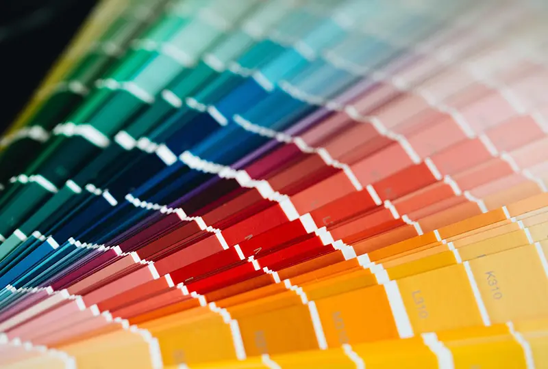
Just like the colors in your home, what you choose for your website can have an impact on how a person feels. As color guru Leatrice Eisman says in her book Color – Messages & Meanings: A PANTONE Color Resource, the usage of color is “a means of instant communication.” What is the message you want to communicate to your website visitors?
Is your site about action and adventure? If so, you probably don’t want to go with pale blues and light greens. These colors usually give the sense of calmness, serenity, relaxation, and tranquility. You wouldn’t want your customers to think that you offer nap-time while driving go-karts or bulking up during a fitness bootcamp.
Inversely, you wouldn’t want to use brilliant oranges and reds for a spa resort that claims to be good for stress relief. That would be counter-productive to what you want your audience to feel when they look at your website. The emotions that a color makes a person feel need to match the content you are putting online. Otherwise, you run the risk of damaging your business’ reputation without even saying anything bad with words.
Here are some great tips from Leatrice Eisman’s book:
When using text and/or graphs:
- Limit text to phrases-simply stated and to the point
- Maximize white space between points to avoid cluttered look
- Choose a basic text color that best reflects the message […]
- Changing the color of a word or phrase within the body of the text will make the word or phrase more memorable
- Legibility is best served by contrast-light text on darker background or dark on light
- White against a color can provide high contrast. […We perceive] white as a brilliant color.
I’ve loved using this book to get a better understanding of the fascinating world of consumer responses to color.
 An updated edition entitled, The Complete Color Harmony, Pantone Edition: Expert Color Information for Professional Results, is now on the market, available on Amazon. This edition includes information on creating special effects, as well as an entirely new section devoted to the psychology of color. Eiseman helps readers determine their best color choices and suggests why some colors may inspire their creativity while others don’t. As an Amazon Associate we earn from qualifying purchases. #Commissions Earned


